ColorScale technology translates grayscale values into the color space, resulting in a color scheme that exhibits similar properties (lightness and contrast, specifically) to the original grayscale input.
This solves a particularly challenging question for designers who work with color schemes: “Do these colors work together, and if so, what is their relationship?”
Background
The math behind ColorScale technology is based on the color cube, which is a three-dimensional space created by the 3-channel RGB (red, green, blue) scheme used to represent colors used in digital media.
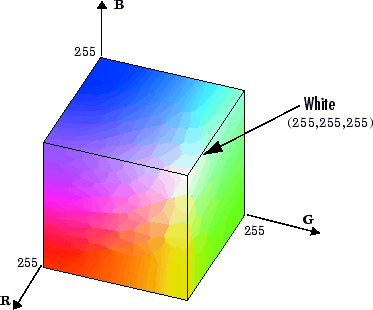
FIGURE 1. The color cube, with black represented as (0, 0, 0) and white as (255, 255, 255).
The grayscale line runs diagonally through the color cube from pure black (0, 0, 0) to pure white (255, 255, 255). Every point on the grayscale line has a corresponding set of points—valid color translations—in the color cube at some distance away, Δ, that also exhibit the same lightness (distance from black).
Each of these points lies on a color wheel, as illustrated below:
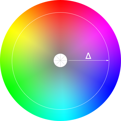
FIGURE 2. The set of points at some distance, Δ, from the grayscale line (center) represent a trip around the color wheel.
Figure 2 depicts a 2-dimensional trip around the color wheel. However, because the color cube is 3-dimensional and because of how lightness works, valid color translations are not found on the same plane of the color cube as the grayscale input color, and thus cannot be depicted accurately in only two dimensions.
The following figures show where the wheel of valid color translations lies in relation to a grayscale input:
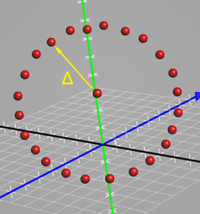
FIGURE 3. Front view of valid color translations in the color cube. The central point is the grayscale input; the points surrounding it are valid translations within the color cube at a certain distance, Δ. Each point exhibits the same lightness (distance from black) as the grayscale input.
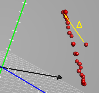
FIGURE 4. Side view of valid color translations in the color cube. This image is particularly revealing because you can see that the valid color translations lie in a different plane than the grayscale input.
The aim of ColorScale technology is to identify these valid color translations—precise points in the color cube—in order to simplify and improve the inherently difficult task of working with color and maintaining lightness/contrast integrity.
Benefits
Working with colors is much more difficult than working with grayscale—in fact, it’s a difference of one dimension versus three dimensions.
If a designer is trying to answer the question, “Do these colors work together?”, it would be nearly impossible for her to reliably state the difference between any two colors if she had chosen them arbitrarily (as is often—if not always—the case).
It’s not her fault, though—it’s incredibly difficult to gauge the relative lightness of reds, blues, and greens when comparing them to one another. The temperature differences between colors and the way those colors affect our eyes severely limit our ability to make accurate “eyeball” comparisons or assessments.
Quite simply, working with the three dimensional color space is difficult and mostly unintuitive.
However, working with a single dimension is easy and intuitive for just about everyone, and that’s what ColorScale technology is all about.
By starting with a grayscale input, a designer can make quick and accurate assessments of the colors she’s using.
In other words, by drowning out the multi-dimensional noise of the color cube and instead focusing on the properties conveyed through grayscale, a designer can more quickly answer the question, “Do these colors work together?” (and with a certainty that was not there before!)

FIGURE 5. One-dimensional grayscale values convey lightness and contrast, which are the most important factors in determining whether or not two colors will work well together. Note: Hexadecimal values are used in interface images because that’s the most common form of color input used in website CSS.
Establishing lightness/contrast relationships in grayscale and then moving those relationships into the color space preserves them in a way that arbitrary color selection simply cannot.
Finding Accurate Color Translations
Initially, ColorScale technology takes a grayscale color input and translates it into the color space. From there, a user can select a specific color into which she’d like to translate her original grayscale.
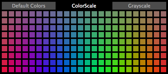
FIGURE 6. The top row of swatches in the color picker depicts a single trip around the color wheel at a distance of 40 units away from the grayscale line. The bottom row shows colors that are 160 units away from the grayscale line; notice how the colors get more saturated (and less gray) as they move further away from the line.
The result of this operation is a monochromatic color scheme, as shown in the image below.
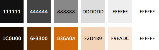
FIGURE 7. Translating grayscale values into the color space yields a monochromatic color scheme.
If there’s a “trick” to ColorScale technology, it’s calculating the color translations accurately enough to maintain lightness/contrast integrity with the grayscale input. This is achieved by ensuring that the color translations are approximately the same distance away from pure black, Δ0, as the grayscale input.
It’s possible to calculate distance in any number of dimensions by using the Pythagorean theorem. As we’ve already covered, the RGB color space is 3-dimensional, so the total distance, Δ, moved within the color space can be defined as:
Since the ColorScale process starts with a grayscale input, the first step is to determine the distance to black, Δ0, for that input. In subsequent examples, we’ll assume a grayscale input of (128, 128, 128), which is in the middle of the color cube.
For the grayscale input, the Δ0 is 221.703, and this gives us our first constraint: Valid color translations for (128, 128, 128) must exhibit a Δ0 that is similar to this value.
Our second constraint is inherent to the RGB color system as it currently exists in digital media. Specifically, we are restricted to using integer values for our R, G, and B channels.
This constraint introduces an error into our calculations. In other words, our resulting color translations will all include some degree of error; the trick is to minimize that error to preserve lightness/contrast relationships from the grayscale input.
With our constraints established, we can now focus on finding viable color translations—that is, colors in the cube at some distance, Δ, away from the grayscale input that also exhibit a similar Δ0.
Simply moving Δ units away from the grayscale line is easy; moving Δ units in a direction that yields colors with a similar Δ0 is the challenge of ColorScale technology.
The following equations and Pythagorean transforms are useful for ensuring a low-error Δ0 while still producing a color that is Δ units away from the grayscale input:
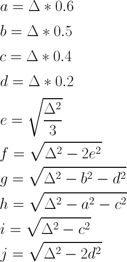
Please note that each result from these equations must be rounded to the nearest integer so it can be used to manipulate RGB channels in digital media.
Pythagorean Transforms:
- Cardinal colors:
- (f, -e, -e)
- (-e, f, -e)
- (-e, -e, f)
- Flanking cardinals:
- (-h, a, -c)
- (-h, -c, a)
- (a, -h, -c)
- (a, -c, -h)
- (-c, -h, a)
- (-c, a, -h)
- Hex interstitials:
- (-g, b, -d)
- (-g, -d, b)
- (b, -g, -d)
- (b, -d, -g)
- (-d, -g, b)
- (-d, b, -g)
- More hex interstitials:
- (-i, c, 0)
- (-i, 0, c)
- (c, -i, 0)
- (c, 0, -i)
- (0, -i, c)
- (0, c, -i)
- Anti-cardinal colors:
- (-j, d, d)
- (d, -j, d)
- (d, d, -j)
In total, these Pythagorean transforms yield 24 points inside the color cube that are viable complements for the grayscale input.
For completeness, let’s look at a sample calculation for (128, 128, 128) with a Δ of 100:
- Cardinal colors:
- (57, -58, -58) → (185, 70, 70)
- (-58, 57, -58) → (70, 185, 70)
- (-58, -58, 57) → (70, 70, 185)
- Flanking cardinals:
- (-69, 60, -40) → (59, 188, 88)
- (-69, -40, 60) → (59, 88, 188)
- (60, -69, -40) → (188, 59, 88)
- (60, -40, -69) → (188, 88, 59)
- (-40, -69, 60) → (88, 59, 188)
- (-40, 60, -69) → (88, 188, 59)
- Hex interstitials:
- (-84, 50, -20) → (44, 178, 108)
- (-84, -20, 50) → (44, 108, 178)
- (50, -84, -20) → (178, 44, 108)
- (50, -20, -84) → (178, 108, 44)
- (-20, -84, 50) → (108, 44, 178)
- (-20, 50, -84) → (108, 178, 44)
- More hex interstitials:
- (-92, 40, 0) → (36, 168, 128)
- (-92, 0, 40) → (36, 128, 168)
- (40, -92, 0) → (168, 36, 128)
- (40, 0, -92) → (168, 128, 36)
- (0, -92, 40) → (128, 36, 168)
- (0, 40, -92) → (128, 168, 36)
- Anti-cardinal colors:
- (-96, 20, 20) → (32, 148, 148)
- (20, -96, 20) → (148, 32, 148)
- (20, 20, -96) → (148, 148, 32)
Note: These colors, along with the grayscale input, are depicted in the color cube in Figures 3 and 4 above.
Although we are only using 5 basic Pythagorean transforms, we actually end up with 24 viable color transform points because each transform has a maximum of 6 different variants. Some transforms, like those for cardinal and anti-cardinal colors, only have 3 unique variants.
Thus, using the 5 basic transforms presented here yields 24 unique color translation points.
By selecting one of these unique color points, the user can indicate how she would like her grayscale to be translated into the color space.
In reality, the user does not indicate a specific color. Instead, she indicates transform + variant combination that can be used to translate many grayscale inputs in the exact same way.
And this is how ColorScale technology moves from input to result, as shown in Figure 7 above. The user specifies a transform + variant combination in Figure 6 (by selecting a color swatch), and then ColorScale transforms the grayscale input accordingly.
Although maintaining lightness/contrast relationships while moving from grayscale into the color space is critical, it’s just a stepping stone for producing a competent color scheme.
Ultimately, monochromatic color schemes are boring. Most designers prefer to use at least two base colors, and sometimes more if the situation calls for such a palette.
In order to be truly useful, then, ColorScale technology must go beyond monochrome translations and introduce complementary color selection.
Complementary Color Tuning
In this case, the phrase “complementary colors” does not refer to “any colors that work with the original input color.” Instead, it refers to other colors within the color cube that are the same distance away from pure black (or pure white) and far enough away from the original input color to be considered “complementary.”
Interestingly, any color contains all the data necessary to determine its complements.
To illustrate, have a look at the image below, which contains an input color, D36A0A (211, 106, 10), and its 5 potential complements.
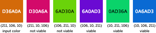
FIGURE 8. D36A0A (211, 106, 10) and its 5 complements. Notice how each complement is simply a different mixture of the channel values from the input color.
Given any color in the color space, there are 5 potential complements that can be obtained by swapping channel values in the manner shown above. Of these 5 potential complements, some are “closer” in the color cube, while the remainder are “further away.”
Generally speaking, complements that are “further away” exhibit a high enough contrast to the original color to be useful, while “closer” complements are too similar to the original color to be effective.
The actual distance at which a color is “too close” or “acceptably far away” differs based on the input color and the complements it yields.
Let’s look at an example for the input color from Figure 8:
D30A6A(211, 10, 106) — Δ ≈ 135.7656AD30A(106, 211, 10) — Δ ≈ 148.4926A0AD3(106, 10, 211) — Δ ≈ 246.2560AD36A(10, 211, 106) — Δ ≈ 246.2560A6AD3(10, 106, 211) — Δ ≈ 284.257
For the complements above, the average distance away from the original color is 212.205. ColorScale technology accepts any complement that is further away than the average distance of all complements, so in this case, only the last three are considered viable.

FIGURE 9. Complements for D36A0A depicted on the color wheel. Viable complements fall on the opposite side of the wheel from the input color.
In the image above, complements 3, 4, and 5 are viable. Notice how they are positioned on the opposite side of the color wheel from the input color, while the non-viable complements are much closer to the input color.
Using the average Δ method introduced above, ColorScale technology can quickly and accurately identify relevant complementary colors for any input color.
Conclusion
ColorScale technology is a tool that enables both designers and users to navigate the color space with a mathematical precision and certainty that was not available before.
Because it starts with a grayscale base, ColorScale makes it easy to establish an intuitive relationship (lightness and contrast) and then move that relationship into the color space.
Before ColorScale technology, designers and users elected to select arbitrary colors—with arbitrary relationships between the colors—in order to construct a color scheme.
At best, designers who understood color and contrast could still produce effective color schemes, but their colors and relationships were still imprecise.
At worst, users with little or no understanding of color would produce incoherent color schemes that only belong in the digital trash bin.
ColorScale technology helps both the savvy designer and the neophyte user by delivering a simple, intuitive way to create color schemes founded upon precise mathematics.